Radio Station Website Design: 8 Principles That Actually Work
Radio Station Website Design: 8 Principles That Actually Work
A radio station website has a job that most websites do not: it needs to get someone listening within seconds. Not reading. Not browsing. Listening.
That single requirement shapes everything about how a radio station website should be designed. The choices you make about layout, navigation, speed, and visual hierarchy all serve one purpose — reducing the distance between a visitor arriving and audio playing in their ears.
Most station websites get this wrong. They bury the player, load slowly, look terrible on phones, or overwhelm visitors with cluttered layouts. The result is the same every time: people leave before they ever hear a note.
Here are eight design principles that separate effective radio station websites from forgettable ones, with practical guidance you can apply today.
1. Mobile-First Design
This is not a preference. It is a requirement based on how people actually listen.
Over 70% of internet radio listening now happens on mobile devices. Your listeners are on buses, in kitchens, at gyms, and walking down the street. If your website does not work beautifully on a phone screen, the majority of your potential audience is having a bad experience.
Mobile-first design means you start by designing for the smallest screen, then scale up. Not the other way around. In practice, this means:
Single-column layouts that do not require horizontal scrolling. Content stacks vertically and flows naturally on narrow screens.
Touch-friendly elements. Buttons and links need generous tap targets — at least 44x44 pixels. Nothing is more frustrating than trying to tap a tiny play button while holding a phone in one hand.
Readable text without zooming. Body text should be at least 16 pixels. Anything smaller forces users to pinch and zoom, which is a signal that your site was not designed for them.
Simplified navigation. A hamburger menu is fine on mobile. What matters is that the most important actions — listen live, see the schedule, explore shows — are immediately accessible without digging through menus.
Test your site on actual phones, not just browser dev tools. Load it on an older Android phone over a cellular connection. If it works well there, it will work everywhere.
2. Prominent, Persistent Audio Player
Your audio player is the single most important element on your website. Everything else exists to support it.
The player should be visible the moment someone lands on any page. Not after scrolling. Not after clicking a menu. Immediately. A sticky player bar fixed to the top or bottom of the viewport works well because it stays visible no matter where the visitor navigates.
One click to play. The path from landing to listening should be a single, obvious tap on a large play button. No registration walls, no pop-ups, no interstitial pages. One click, audio starts.
Persistence across pages. When a visitor navigates from your homepage to your schedule page, the audio should keep playing. Reloading the stream every time someone clicks a link is a deal-breaker. A persistent player that survives page navigation is essential.
Now-playing information. Show the current track or show name in the player. This gives listeners context and makes the experience feel alive rather than static. Album art, when available, adds visual richness.
Volume control and mute. Simple but essential. Some visitors want background listening at low volume. Give them control.
The biggest mistake stations make is treating the player as just another element on the page. It is not. It is the reason the page exists.
3. Clear Show Schedule
After the player, the schedule is the most important content on your site. It answers the question every listener has: what is on now, and when should I come back?
An effective schedule design shows three things at a glance:
What is on right now. Highlight the current show prominently — show name, DJ name, time slot, and a brief description. Visitors should be able to identify this within two seconds of looking at the schedule page.
What is coming next. Display the upcoming show or two below the current one. This creates a reason to stay or a reason to return at a specific time.
The full weekly grid. A complete schedule that lets listeners plan their week. Organize it by day with clear time slots. Allow filtering by show type or DJ if your schedule is complex.
Use color coding, icons, or visual markers to distinguish show types. A music show, a talk show, and a community news program should be visually distinct. Include show artwork or DJ photos to make the schedule feel personal rather than like a spreadsheet.
Make sure the schedule reflects the listener's local time zone, or at the very least, clearly states which time zone is displayed.
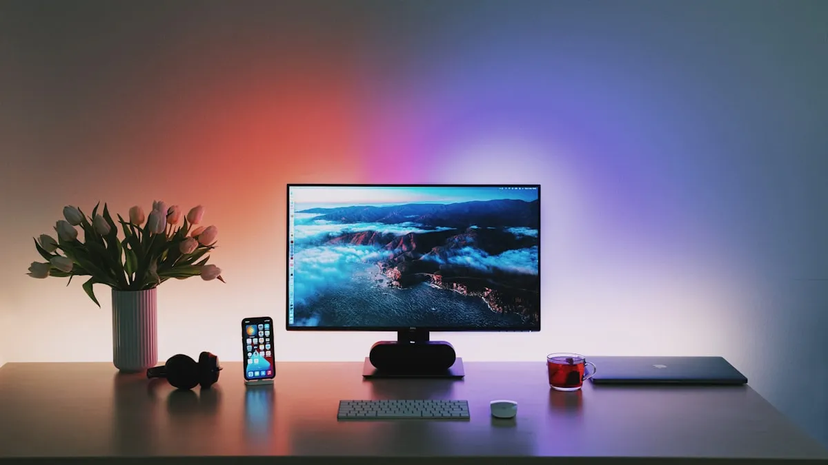
4. Strong Visual Identity
Your website is your station's visual voice. It should feel as intentional and consistent as your on-air sound.
Consistent color palette. Choose two to three primary colors and use them consistently across every page. Your colors should reflect your station's personality — bold and energetic for a dance music station, warm and refined for jazz, raw and high-contrast for punk or alternative.
Purposeful typography. Select one font for headings and one for body text. Make sure both are highly readable on screens. Avoid novelty fonts that sacrifice legibility for style. Your heading font can have personality; your body font should be clean and neutral.
Cohesive imagery. Use photos and graphics that share a consistent style, tone, and quality level. If you use photos of your DJs, invest in decent portraits rather than cropped selfies. If you use illustrations, keep them in the same style. Visual inconsistency makes a site feel amateur.
Your logo, used well. Your station logo should be in the header of every page, clearly visible but not overwhelming. It anchors the brand. Make sure it works at small sizes (for mobile headers and favicons) and on different background colors.
Visual identity is not about making things "pretty." It is about making your station feel professional, trustworthy, and worth spending time with. A listener who arrives at a well-designed site is more likely to press play than one who arrives at a cluttered, inconsistent mess.
5. Fast Page Load Times
Speed is not a technical nicety. It is a design principle that directly affects whether people stay or leave.
Research consistently shows that 53% of mobile visitors abandon a site that takes longer than three seconds to load. For a radio station, every second of delay is a second where a potential listener might close the tab and open Spotify instead.
Optimize images. Use modern formats like WebP. Compress aggressively — a hero image does not need to be 4MB. Serve appropriately sized images for each device (do not send a 2000-pixel-wide image to a phone screen).
Minimize HTTP requests. Every font, script, stylesheet, and image is a separate request that adds loading time. Be deliberate about what you include. Do you really need five JavaScript libraries and three custom fonts?
Prioritize above-the-fold content. The player and key content should load and render first. Defer non-essential elements. A visitor does not need to wait for your footer sponsors to load before they can press play.
Use caching effectively. Static assets like logos, CSS, and JavaScript should be cached so returning visitors experience near-instant loads.
Test your site speed regularly with tools like Google PageSpeed Insights or WebPageTest. Aim for a Largest Contentful Paint under 2.5 seconds and a Time to Interactive under 3.5 seconds.
6. Easy Content Discovery
A radio station website is more than a player page. If you have a blog, podcasts, events, and show archives, visitors should be able to find and explore them without effort.
Visible navigation. Your main content sections — schedule, shows, blog, podcasts, events — should be in the primary navigation. Not hidden in a sub-menu. Not linked only from the footer. In the main nav, clearly labeled.
Homepage as a gateway. Your homepage should provide clear pathways to every major content area. A "Latest Episodes" section, an "Upcoming Events" preview, a "From the Blog" block — these invite exploration without requiring visitors to hunt through menus.
Internal linking. Link between related content. A blog post about an artist should link to the show that features their music. A show page should link to its podcast archive. An event page should link to the DJ who is performing. This web of connections keeps visitors engaged and helps search engines understand your site structure.
Search functionality. If you have more than a handful of content pages, include a search bar. Visitors who are looking for something specific should not have to browse through archives.
The goal is making your content surface naturally. Every visitor who discovers your podcast archive, reads a blog post, or finds an upcoming event is deepening their relationship with your station.
7. Social Proof and Community
Humans are social. We are more likely to listen to a station that feels alive and populated than one that feels like a ghost town.
Listener activity indicators. Showing that other people are listening right now — even a simple "243 listeners" counter — creates a sense of shared experience. People want to be part of something, not alone in a void.
Testimonials. A few genuine quotes from real listeners or DJs carry more weight than any marketing copy you could write. Place them on your homepage or about page. Use real names and photos when possible.
Social media integration. Display your latest social posts or a live social feed on your site. This shows that your station is active and engaged beyond the broadcast itself. It also gives visitors an easy path to follow you on their preferred platform.
Community features. Dedications, song requests, listener polls, music chart voting, and chat features all signal that your station has an active, engaged community. They also give new visitors a way to participate immediately rather than passively consuming.
DJ profiles with personality. Showcase your DJs with photos, bios, and their social media links. Putting faces and personalities behind the voices humanizes your station and creates points of connection for listeners.
Social proof does not have to be manufactured. If your station has real listeners and real community engagement, let that show on your website. Authenticity is always more convincing than polish.
8. Clear Calls to Action
Every page on your site should make it obvious what you want the visitor to do next. Do not make them guess.
Listen live. This is always the primary call to action. The play button should be the most visually prominent interactive element on every page.
Subscribe. Whether it is a podcast subscription, an email newsletter signup, or social media follow — give visitors a clear, specific way to stay connected after they leave your site.
Donate or support. If you accept donations, make the path to giving simple and visible. A "Support Us" link in the navigation and a clear donation page with minimal friction is the standard. Do not bury your donation option in the footer — stations that make it easy to donate receive more donations.
Contact. Make it easy for listeners, potential guests, advertisers, and press to reach you. A contact form, an email address, or both. Do not make people search for how to get in touch.
Design your calls to action with visual hierarchy. Use contrasting colors for primary action buttons. Make them large enough to be tapped comfortably on mobile. Use action-oriented text: "Listen Now" is better than "Player," and "Support Our Station" is better than "Donations."
Limit calls to action on any given page to two or three. Too many options create decision paralysis. On most pages, "Listen Live" plus one secondary action is enough.
Common Mistakes to Avoid
Even stations that understand these principles can stumble on execution. Here are the most frequent design mistakes to watch for.
Auto-playing audio. It seems logical — you are a radio station, so play audio automatically. But auto-play audio without user consent is obnoxious, violates browser policies, and causes people to close tabs immediately. Always require a click to start playback.
Cluttered homepages. Trying to put everything on the homepage results in visual chaos. Prioritize ruthlessly. The player, the current show, and two to three content previews are enough. Everything else has its own page.
Outdated content. A "Latest News" section from six months ago or an events page listing last year's holiday party makes your station look abandoned. Only display dynamic content if you can keep it current. If you cannot commit to blogging regularly, remove the blog section from your homepage.
Poor contrast and readability. Dark text on a slightly less dark background, light text on a medium background, decorative fonts for body text — all of these sacrifice readability for aesthetics. Check your color contrast ratios (WCAG AA standard requires at least 4.5:1 for body text) and prioritize legibility.
Ignoring accessibility. Your website should be usable by everyone, including people with visual, motor, or cognitive disabilities. Use semantic HTML, provide alt text for images, ensure keyboard navigation works, and test with a screen reader. Accessible design is not extra work — it is good design that benefits all users.
Splash pages and interstitials. Anything that stands between a visitor and your content is a barrier. Skip the "Enter Site" page, the age verification wall (unless legally required), and the full-screen newsletter popup that fires before someone has read a single word.
The Easier Way: RadioSiteMaker
Implementing all eight of these principles from scratch requires design expertise, front-end development skill, and ongoing maintenance time. Most indie stations do not have those resources — and should not need them.
RadioSiteMaker applies every principle in this article by default. For $99/year, you get a radio station website that is:
- Mobile-first — responsive design that looks and works great on every screen size
- Built around the player — persistent, sticky audio player that keeps playing across page navigation
- Schedule-forward — clear, always-current show schedule with now-playing awareness
- Visually consistent — customizable color palette and font pairings that maintain professional design standards
- Fast — optimized for quick load times without any configuration on your part
- Content-rich — blog, podcasts, events, charts, DJ profiles, and more — all easily discoverable
- Community-oriented — dedications, donations, chat, and social integration built in
- Action-driven — clear calls to action throughout, designed to convert visitors into listeners
The 10-step setup wizard lets you configure your station's visual identity, enable the features you need, and go live in minutes. No design skills required. No theme customization nightmares. No plugin conflicts.
Your time is better spent on programming and community than on CSS debugging.
Start your free trial at RadioSiteMaker.com
Frequently Asked Questions
What is the most important element on a radio station website?
The audio player. Everything else on the site exists to support the act of listening. If a visitor cannot find the play button within two seconds of landing on any page, your design has failed at its primary job. Make the player persistent, prominent, and one click to activate.
How do I choose colors and fonts for my radio station website?
Start with your station's personality. A high-energy dance station might use bold, saturated colors and a modern sans-serif font. A classical or jazz station might use subdued, warm tones and an elegant serif. Choose two to three colors and two fonts maximum. Ensure your text colors have sufficient contrast against their backgrounds for readability. When in doubt, simpler is better.
Should my radio station website auto-play audio?
No. Auto-playing audio violates modern browser policies (most browsers block it), annoys visitors who are not expecting sound, and causes people to close your tab immediately. Always require a deliberate click or tap to start playback. Make that click as easy and obvious as possible, but let the visitor initiate it.
How fast should my radio station website load?
Aim for a Largest Contentful Paint under 2.5 seconds and full interactivity under 3.5 seconds. Over half of mobile visitors will abandon a site that takes more than three seconds to load. Compress images, minimize external scripts, and test regularly with Google PageSpeed Insights. Speed is especially critical on mobile, where your majority of listeners are.
Do I need a custom-designed website, or can I use a template?
A well-designed template built specifically for radio stations will outperform a generic custom design in almost every case. Radio station websites have unique requirements — persistent audio player, schedule integration, now-playing metadata, podcast feeds — that general-purpose templates and page builders handle poorly. A purpose-built platform like RadioSiteMaker includes these features by default, saving you the cost and complexity of custom development.

Founder of RadioSiteMaker. Passionate about making professional radio station websites accessible to every broadcaster.
Get radio station tips in your inbox
Free guides on growing your audience, building your website, and running a better station. No spam, unsubscribe anytime.
Related Articles
How to Create a Radio Station Website in 2026
Step-by-step guide to building a professional radio station website. Compare DIY WordPress, custom development, and managed platforms like RadioSiteMaker.
11 Features Every Radio Station Website Needs in 2026
The must-have features for a modern radio station website. From live streaming players to podcast hosting, here's what your station website needs to succeed.
How to Add a Live Audio Player to Your Radio Station Website
A complete guide to adding a live streaming audio player to your radio station website. Compare embeddable players, WordPress plugins, and managed solutions.
Skip the WordPress hassle
Your radio station website, live in 10 minutes. Custom domain, live player, schedule, podcasts, blog — everything included for $99/year.
Start Your Free Trial